How Lighting Is Everything: illuminating your way to a good headshot.
Lighting, it’s what makes a great headshot.
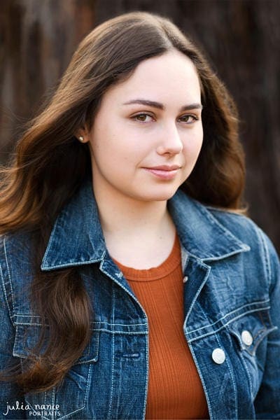
It is lighting that sets good photography apart from mediocre photography. So when it comes to headshots and portraiture, the lighting is really important – it can even make or break the shot. It can be the difference between you been perceived as either professional or unprofessional.
Not only is your professional reputation on the line, but the lighting in your headshot or portrait also sets the tone and mood of the image. Flattering lighting can help showcase you as approachable and friendly. Whereas dark, contrasty and moody lighting often has the opposite effect. So it is always good to consider what style of lighting will work for you, your industry, and the feeling or ‘vibe’ that you would like to achieve.
A good lighting checklist:
Let’s have a look at some of the considerations to make when lighting, and specifically what good lighting is:
- Bright and clear: there is enough light on you for the camera to make a good exposure, and clearly show your features.
- A good balance of shadows and highlights: you don’t want to be washed out, but you don’t want to have deep shadows over your face. An evenly lit face, that still shows definition, is really key here.
- Illuminates the eyes: Your eyes are the window to your soul. It’s what we seek out in a headshot or portrait. Having well-illuminated eyes is really key.
- Atmosphere: the lighting around you. If that be a little highlight on your hair, some afternoon sun, or just a clean and evenly-lit background. The lighting around you (not just on you) is just as important.
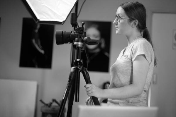
When using a professional photographer:
If you hire a professional portrait photographer, there is (hopefully) a good chance that they know how to manipulate light to get great results.
The first step is checking out their portfolio. You can have a look at their lighting across their work to get an indication on their skills: if that be in a studio or with natural light.
Some things to look out for are:
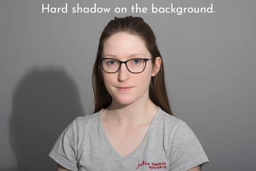
- The ability to light a backdrop evenly when in the studio.
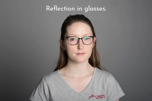
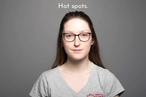
No awkward, harsh shadows, or bright hot spots in the background. - Capturing a glasses-wearing person reflection-free.
There is always a workaround with reflections in glasses: either by moving the lights or moving the subject. - Are their images well exposed?
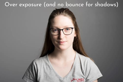
Not only is it the lighting, but it’s the handle of exposure in that lighting setup/condition. A photographer should be able to balance the lighting for a flattering result. This can be as simple as diffusing bright light, reflecting or flagging light, and controlling the highlights and shadows (remember: flattering lighting on the face and bright illuminated eyes are always great for headshots!). - A range of lighting styles or conditions:
Can they vary their lighting? Have they photographed in different times of the day, in different locations? Do they have experience shooting in the way you’re looking (eg: studio or outdoors)? These are all questions you should consider when picking a photographer. - Does their portfolio show examples of lighting you like?
This sounds really obvious, but make sure you actually like the photos. Not just because they have photographed a friend, or they’re a relative of yours. But have a look at their content and make sure you like their lighting style.
Let’s look at some examples:
I’m going to take you through some different images to discuss the lighting, and what makes it flattering.
Corporate look in the studio:

An evenly lit backdrop:
Keeps the focus on the subject, and allows for consistency across a team of employees.
Catchlights in the eyes:
Little reflections in the eyes make sure that they’re bright and catch our attention.
An evenly lit face:
No strong or unflattering shadows to distract us.
Enough definition:
Enough shape and form in the soft shadows to give depth to the headshot.
Exposed correctly:
The subject is neither too bright or too dark. She stands out from the backdrop and we can see her clearly.
Soft, Natural Light Outdoors:

Soft light on the face:
Taken in ‘bright’ shade, the lighting across the face is soft and natural. This is achieved by a brighter, open space in front of here (there was an open field in front of her – despite the trees in the background!).
Bright eyes:
Enough light is filling in her eyes. They’re bright and stand out.
Gentle shadows:
The shadows in this image are soft. The lighting is soft, and therefore we don’t have shadows and highlights creating strong contrast.
A stylised Actor Headshot:
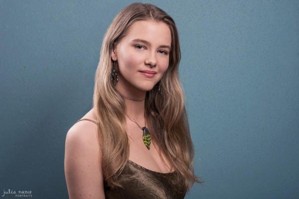 Defined Lighting:
The lighting here is stronger than the above examples, yet the direction of the light still allows for consistent illumination of the face.
No distracting shadows:
There are no strong shadows that distract from her face. Rather, the contrast emphasises her bone structure and form.
Atmosphere:
The atmosphere is created with the introduction to a light behind the subject. It creates a soft glow on her hair and arm.
Atmospheric Light Outdoors:
Light Atmosphere:
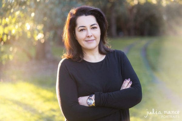
Taken in the beautiful afternoon light, the low angled sun coming from behind the subject creates the atmosphere. The lens flare contributes to this as well.
Evenly lit face:
With the subjects back/shoulder to the sun, the ambient light allows for a soft ‘fill’ in the shadows. The face exposure can be balanced without any strong contrast (which is more likely to occur if the sun had of been partially on her face).
So what lighting should be avoided?
It’s simple enough to take about ‘good’ lighting, but what about the bad?
I wrote an earlier post about lighting mistakes to avoid in the studio, so have a look at these common mistakes below. These are common errors with light placement as well as light intensity. This is where a photographer comes in: having a good understanding of lighting in all respects really helps.
If you’re outdoors there are some things to keep in mind too:
 Stay out of direct sunlight, if you can. Dealing with direct sunlight can be hard to pull off if you’re not experienced, or don’t have the appropriate diffusers and reflectors to manage it. Direct sunlight can cause really harsh shadows on the face, and mess up exposure (it can also cause you to squint – and that’s not ideal for a headshot!).
- Avoid dappled light. Yes, I know it is atmospheric and romantic (and very beautiful), but dappled light will only give you little bright spots over your face, which in turn become very distracting.
- Keep bright (orange) sunset light behind you. It creates such a beautiful atmosphere when you’re backlit anyway, but when it is on your face it can mess with the colour balance and be hard to correct.
How is the lighting in your headshot?
Have a look at the photo you’re using on LinkedIn, your website, your company page, your social media…
What does the light look like? Can you see your face well? Are your eyes nice, bright and visible? If you have taken a photo of yourself or asked a friend, have a think about if the lighting makes you appear professional or unprofessional. Ask others what mood or vibe the image gives off, and consider if their response aligns with your personal brand.
If you’re finding your photo isn’t quite hitting the right spot, then perhaps book in with a professional photographer. If you’re in Melbourne, Australia, get in touch!
Check out my packages for corporate and personal branding sessions.
Corporate Headshots & Branding | Actor Headshots | Staff Headshots | Family Portraits
Book Online | Gallery | About | Contact | Studio | FAQs | Ts&Cs | Privacy Policy

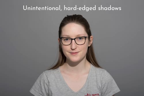
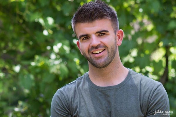 Stay out of direct sunlight, if you can. Dealing with direct sunlight can be hard to pull off if you’re not experienced, or don’t have the appropriate diffusers and reflectors to manage it. Direct sunlight can cause really harsh shadows on the face, and mess up exposure (it can also cause you to squint – and that’s not ideal for a headshot!).